7 tips for a good door sign
Tuesday, May 1, 2018
A practical and visually appealing door sign is easy to create with these tips.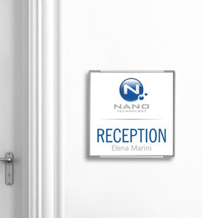

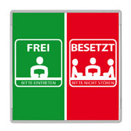
1. Readability
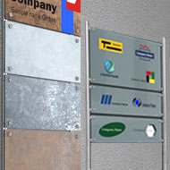
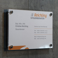
The door sign is for information. Strangers should be able to easily see who or what is behind the door. Elaborate and ornate fonts are not appropriate. Opt for clear, distinct block letters of an appropriate size. Make sure there is a large contrast in color between the background and the writing.2. Interchangeability
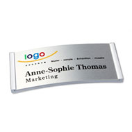
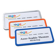
Office today - conference room tomorrow. In practice, it is common to use rooms differently over and over again. For this reason, door signs with inserts are an optimal solution. If necessary, you can exchange the labeling in such a removable frame in just a few simple steps. If this has to be done frequently and quickly, systems with magnetic closures or snap frames are a good solution. The "Click Sign" insert has also proven its worth if the inscriptions are to be exchanged frequently.3. Coverage
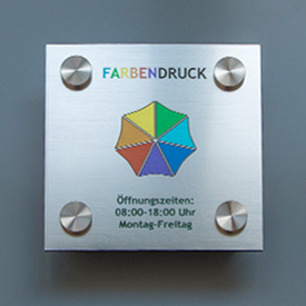
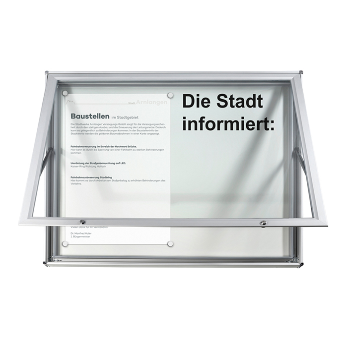
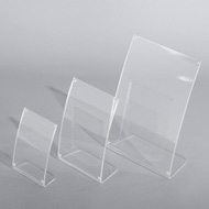
Transparent lightweight plastic covers protect the paper insert and prevent it from getting dirty. Acrylic is fade resistant but somewhat sensitive to scratches. Polystyrene ( PS ) does not scratch easily, but tends to yellow when exposed to UV light. Polycarbonate is by far the most insensitive, but also does not tolerate UV light well. However, this is rather unimportant for door signs indoors.4. Optics
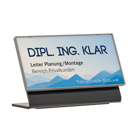
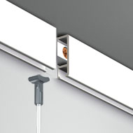
With or without a frame - it's not just a matter of taste. The frame usually protects the door sign edges and prevents dust or moisture from getting to the insert. The interior also plays an important role in the decision. An aluminum frame gives the door sign something dignified. Frameless signs appear light and floating. Arched signs always give the impression of elegance. They clearly stand out from the mass of door signs.