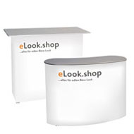
Which signage looks professional? And which subconsciously deters people?
Sunday, February 1, 2026
Spaces speak before people do
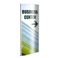
You enter a room. Perhaps a doctor's office, an office building, or a hotel. Even before anyone has said a word, an impression has already been formed. Not consciously, not analytically, but quietly and almost casually. Something feels right. Or perhaps not. Often, this feeling isn't solely due to the furniture or colors. It's due to the signage.Signs are the quietest employees of a company. They welcome, explain, organize, and guide without ever saying a word. And that's precisely why they have so much power. Professional signage creates orientation and trust. Poorly made signage, on the other hand, causes unease, doubt, or even rejection, without it being possible to pinpoint exactly why.
How we perceive signage
People don't read signs like texts. They perceive them. Within fractions of a second, the brain decides whether the signs appear understandable or difficult, clear or chaotic, trustworthy or improvised. We are particularly sensitive to the following:✔
a calm typography,✔
readability from a distance,✔
clean spacing and order,✔
clear contrasts.These elements are perceived as conveying competence. Too many fonts, illogical layouts, or poorly legible colors, on the other hand, create stress, even if the content is factually correct. If one of these elements is missing, the eye begins to search. And searching never feels professional.
Professional signage therefore doesn't work through volume, but through its naturalness. It doesn't impose itself. It's simply there – and it works because it doesn't disturb.
Why does clarity always appear more professional than creativity?
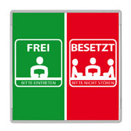
A common misconception is that signage needs to be particularly creative or original to stand out. In reality, however, the opposite is true. The desire to be original quickly leads to fonts, colors, or wording becoming more important than the actual message. Good signage, however, is not original, but unambiguous.
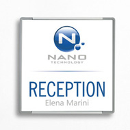
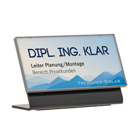
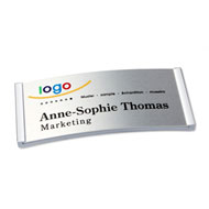
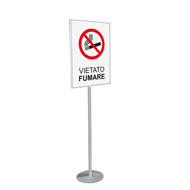
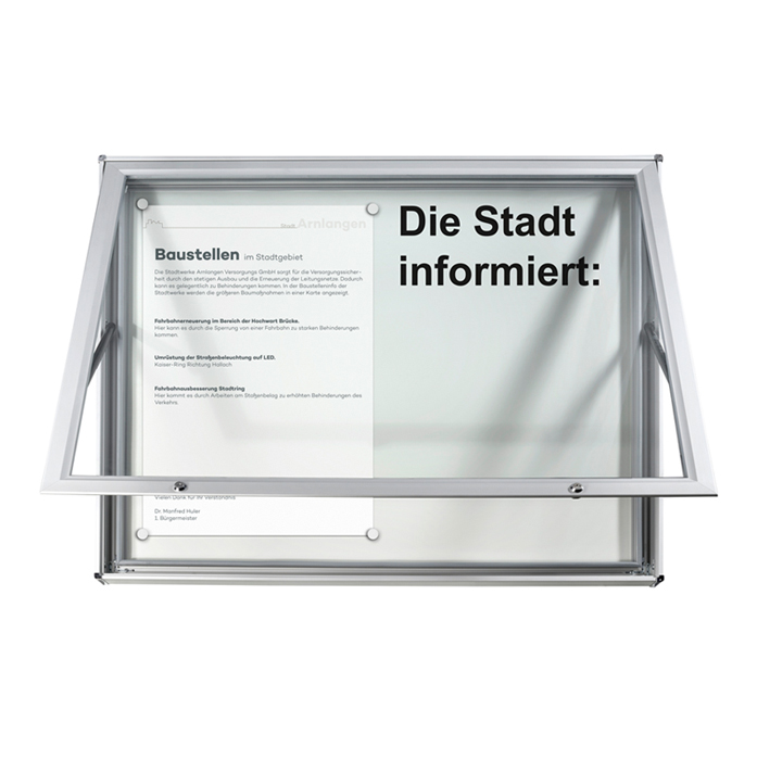
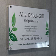
A sign appears professional when it focuses on one task. It answers the question "How does someone find their way around here?" instead of raising several. Anyone who tries to convey multiple messages at once loses their readers before they've even started reading. Clarity isn't a lack of design; it's a sign of maturity. Typical examples of clarity are:
● a clear and unambiguous name without internal abbreviations,
● a key piece of information that is immediately recognizable,
● supplementary information that is visually subordinate.
The reader senses: Someone has put thought into this.
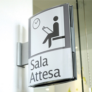
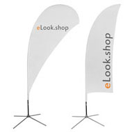
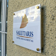
The emotional language of colors, shapes, and materials
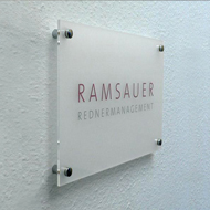
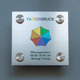
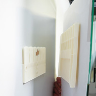
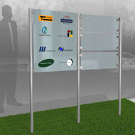
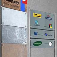
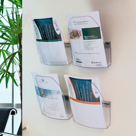
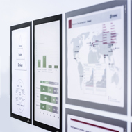
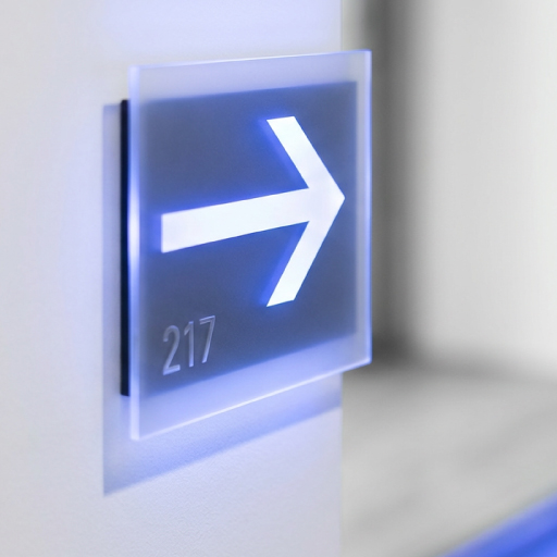
Even before a word is read, the design speaks volumes. Colors create moods, shapes convey order or restlessness, and materials suggest quality. A high-quality acrylic or metal sign sends a different message than a printed sheet of paper. This effect, while not rational, is undeniably reliable. It is crucial in determining whether a company is perceived as sustainable, organized, and trustworthy.The colors also contribute to this impression. Calm, consistent color schemes convey stability, while harsh contrasts can quickly overwhelm. Professional signage uses this effect consciously and judiciously. It follows a clear color concept, repeats shapes, and creates visual calm not to force attention, but to facilitate orientation.
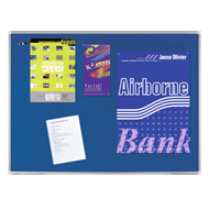
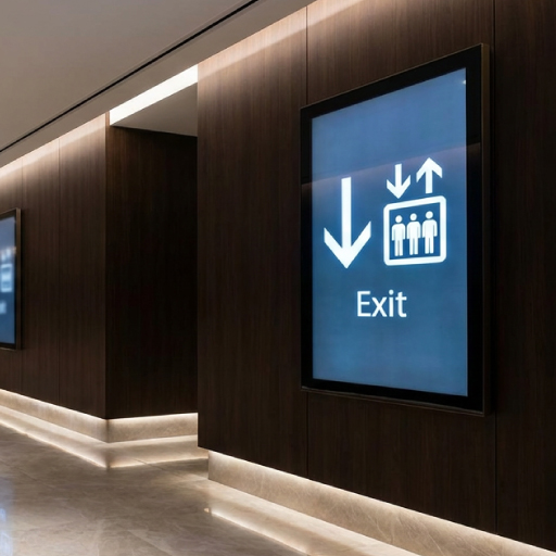
When signage is a deterrent: typical mistakes
It's rarely the big mistakes that irritate people. It's usually the little things that add up:✔
text that's too densely packed;✔
font that's illegible from a distance;✔
signs that look different on every door.✔
Even the tone of voice plays a role. Overly formal language comes across as off-putting, overly casual language as unprofessional.It becomes particularly problematic when signage comes across as didactic or strict. Wording that suggests prohibitions rather than guidance creates distance. Signage is always part of brand communication – even where it's least expected. It remains factual and respectful, explaining without being overpowering.
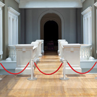
Orientation as part of the brand experience
A good wayfinding system is unobtrusive; you don't consciously perceive it. You simply find the right path without thinking about it. You don't have to search, ask questions, or doubt yourself. This feeling of security doesn't arise by chance. It comes from consistent design, logical wayfinding, and signage that anticipates your needs.And she thinks further: about different visual abilities, perspectives, and distances. Accessibility is not an add-on, but an integral part of genuine quality. Signage is therefore never just information. It is part of the brand experience. It demonstrates whether a company thinks systematically, takes its visitors seriously, and pays attention to detail.
Signage as a reflection of the brand
Every sign tells a story about the company behind it. About order, standards, and attitude. About diligence – or the lack thereof.Consistent and high-quality signage signals: Attention to details is valued here. It shows a willingness to take responsibility – even for the small things. And it is precisely these small details that determine whether a place is perceived as professional.
Conclusion
Professional signage works subtly but effectively. It's not meant to impress, but to be understood. It's calm, clear, and consistent. Unprofessional signage, on the other hand, makes itself known through confusion, uncertainty, or a general sense of unease.Those who understand signs not as a necessary evil, but as part of visual communication, create spaces where people feel safe, welcome, and well-guided. They are thus investing not only in orientation, but also in trust. And that is precisely what ultimately creates a truly professional impression.