Company sign design - minimalist or explanatory?
Sunday, March 1, 2026
 You're standing in front of a building. Perhaps for the first time, and with a touch of uncertainty. You scan the facade – and then you see it: the sign. A name, nothing more. Or conversely: a surface with information, opening hours, specializations, and arrows.
More is decided at this moment than one might think. Signage is not decoration, but a silent form of communication. It begins to have an effect before a word is spoken. Often it starts with a small decision and ends with a big impression.
A new office sign. A company sign for the facade. A door sign in the entrance area. Suddenly the question arises: Is a name in clear typography sufficient, or is explanatory information needed? Minimalist or descriptive? This decision is far more than a matter of taste. It influences how your company is perceived, how easily your customers can find their way around, and how professional your image appears.
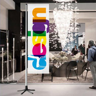
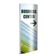
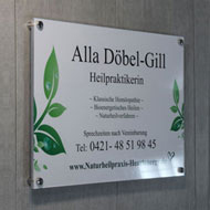
Minimalist Signs: The Power of Reduction
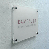
Minimalist signs follow the clear principle of "As much as necessary, as little as possible." Typical features include:✔
only a name or logo,✔
clear, sans-serif typography,✔
plenty of white space,✔
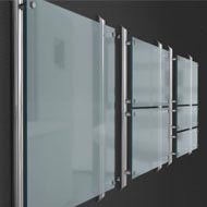
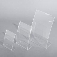
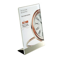
high-quality materials such as stainless steel, acrylic, or glass,✔
a restrained color scheme.Such signs speak quietly but confidently. They signal sovereignty, clarity, a premium positioning, and aesthetic awareness. They imply: "Those seeking us already know why they are here." A minimalist practice or company sign conveys a high-quality impression, especially in modern architectural concepts or design-oriented industries. Its impact depends on the context and is most effective where the brand and surroundings already provide orientation:
1. The target group is visually oriented.
2. The brand name is already known.
3. The surroundings are calm and architecturally clear.
4. They consciously emphasize exclusivity.
A boutique law firm or an architecture office, for example, rarely needs dense blocks of explanatory text. The name is enough, and the surroundings tell the rest. But therein lies the risk. If a visitor is entering the building for the first time, if several parties are located there, or if services require explanation, this reduction in information can make orientation difficult. What appears elegant to design enthusiasts may remain unclear to visitors.
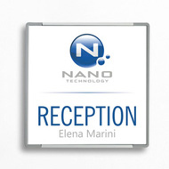
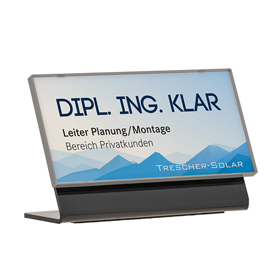
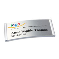
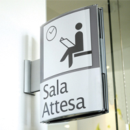
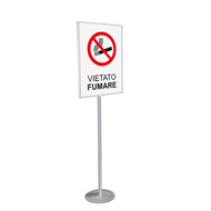
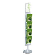
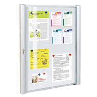
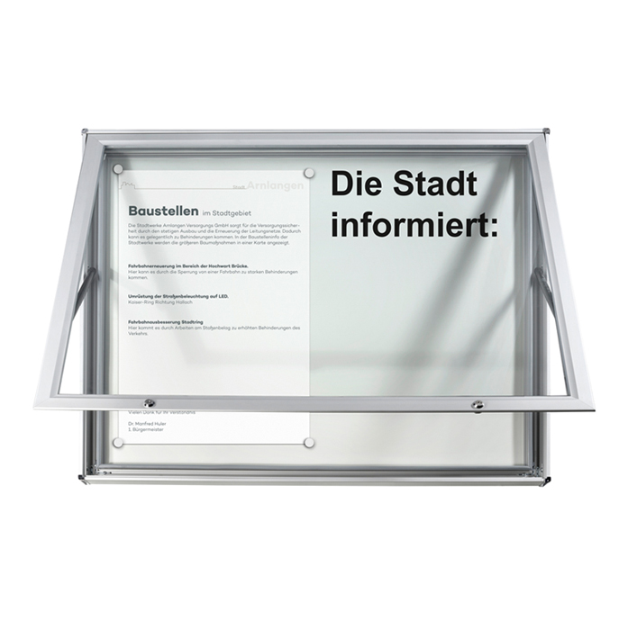
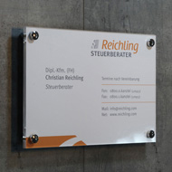
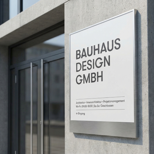
Explanatory signs: Safety through information
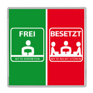
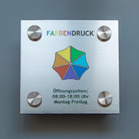
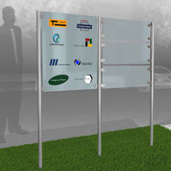
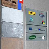
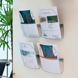
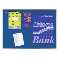
 Explanatory signs take a different approach. They don't impress, but rather guide. The following elements are typical for them:
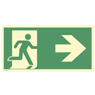
✔
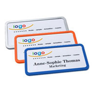
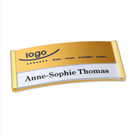
Full company name;✔
Description of services;✔
Opening hours;✔
Contact person;✔
Floor information;✔
Arrows or wayfinding systems.This type of signage conveys a service-oriented, transparent, accessible, and structured image. For many industries, this isn't a matter of style, but of responsibility. In medical facilities, large office complexes, or apartment buildings, explanatory signs are not an added service, but a necessity. From a psychological perspective, explanatory signs convey security and clarity. Transparency builds trust. Clear communication makes one appear approachable.
But even here there is a fine line. If there is too much information, if it is too densely packed, or if everything is printed with weak typography or without any clear design hierarchy, the sign loses its professionalism. It then appears cluttered rather than helpful. The art, therefore, lies in designing information in such a way that it appears effortless.
Psychological impact: What visitors really perceive
There is no "better" or "worse" between minimalist and explanatory design. It's about a psychological effect. This always arises from the interplay of architecture, industry, target group, brand positioning, and visitor situation.Minimalist signs often create a stronger first aesthetic impression, a calmer overall effect, and a more premium brand association.
Explanatory signs, on the other hand, build trust through transparency, a lower barrier to entry, faster orientation, and fewer questions.
The comparison between "minimalist and explanatory" is therefore not a matter of style, but a strategic decision. What matters is the experience you want to offer your visitors. Should the first impression convey exclusivity or orientation? Should your brand or your information speak for itself?
Typical mistakes when choosing a shield type
In practice, the same pattern emerges time and again. Decisions are made intuitively, not from the visitors' perspective. The most common misconceptions are:-"Less always looks more sophisticated."
-"More information never hurts."
-"I have to like the design."
-"Our building is self-explanatory."
However, signage is not an end in itself, but rather a means of communication within a space. A minimalist door sign in a rambling old building can confuse visitors. Conversely, an overloaded medical practice sign on a minimalist glass facade can appear cheap.
In many cases, the most effective solution is a conscious balance. A clearly designed name, complemented by a subtle subtitle. Structured information that leaves room to breathe. Minimalism in design, clarity in content.

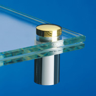
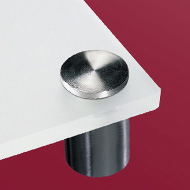
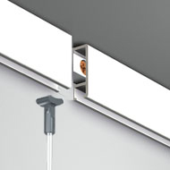
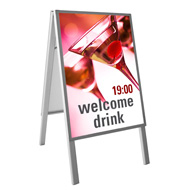
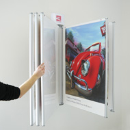
Material, typography and format: underestimated factors
Often, the discussion is reduced to the amount of text. However, other factors influence the effect at least as much:✔
Material (acrylic, stainless steel, glass, aluminum composite)✔
Font choice (modern, classic, technical)✔
Contrast and readability✔
Size in relation to the facade✔
Mounting system (spacers, surface-mounted, freestanding)A minimalist sign made of cheap material immediately loses its credibility.
An explanatory sign with poor typography looks chaotic. With high-quality engraving and clean typography, however, it can appear extremely elegant. Design and information should never be considered separately. They are integral parts of the overall impression.
Conclusion: The right decision is a strategic decision
Should it be minimalist or explanatory? The right decision arises from context, target group, and positioning. Signage is often the first physical contact with your company. It determines whether someone feels safe, impressed, or confused.The best signage is that which goes unnoticed because it functions perfectly, or deliberately stands out because it precisely reflects your brand. Those who understand signage as part of their brand communication use it not only for labeling but also for consciously guiding perception. And that is precisely where its true impact lies.