5 mistakes when buying signs and presentation systems
Thursday, January 1, 2026
 There are moments in everyday business that leave a lasting impression: a successful trade fair appearance, a perfectly organized reception area, or a newly designed office that impresses visitors. But there are also those quiet, subtle disappointments: a sign that keeps slipping, a brochure stand that topples over in the wind, or a "professional" system that simply doesn't work in daily use. These kinds of bad purchases are more than just annoying; they cost time, money, and sometimes even customer trust.
In this article, we'll take you on a journey through typical mistakes when it comes to signage and presentation solutions. We'll show you how to consciously avoid them. This isn't about simple checklists, but about understanding usage, environment, and function – in other words, providing genuine decision-making support.
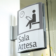
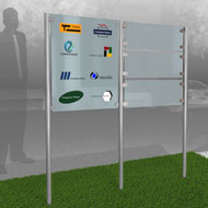
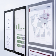
Mistake 1: The shield's design seems more important than its function
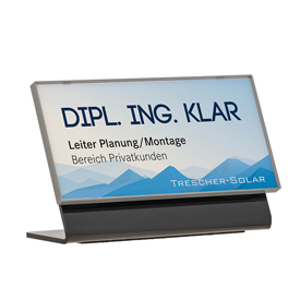
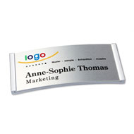
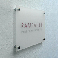
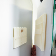
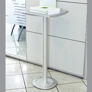
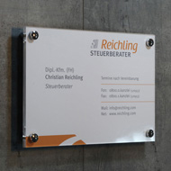
Imagine this: You order an elegant acrylic sign for your reception area. It shines, it looks high-quality – but as soon as it's hung up, it looks out of place. The light reflects off it and doesn't highlight any information. Guests have to tilt their heads to even read what it says.Such a bad purchase often occurs because design is prioritized over function. Beautiful materials like acrylic or glass may appear high-quality, but in certain locations, light reflections or unfavorable viewing angles can render them ineffective. The solution is a simple question: What does this sign need to do?
Is the sign an information provider, a wayfinding sign, or a representative element? The answer to this question determines the material, format, and position.
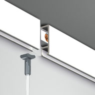
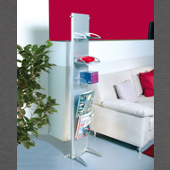
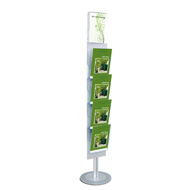
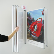
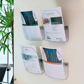
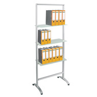
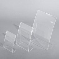
Mistake 2: Incorrect sign size, incorrect brochure stand placement
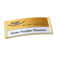
A mistake that seems so simple yet is incredibly common: a sign is too small for the room or is placed where it's not even visible. A small door sign next to a wide-open hallway door, for example, gets lost in the overall picture. Conversely, a large brochure stand in a narrow corner blocks the way.The only solution is a change of perspective: Walk through the space with your customers' eyes. Where does a person look first? Where would a visitor stand if they were looking for something? The answers to these questions are more crucial than technical data on product pages, even though that data is important.
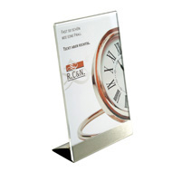
A tailored comparison of height, format and viewing angle before buying a brochure stand saves time later and avoids frustration.
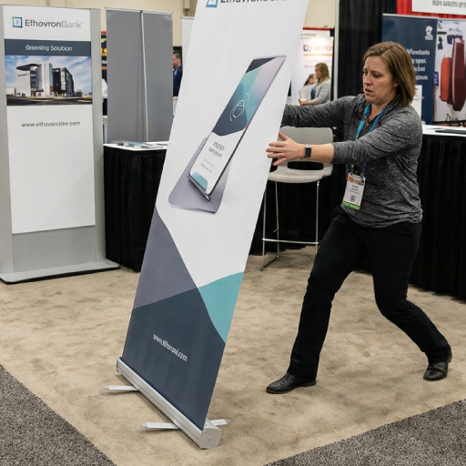
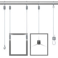
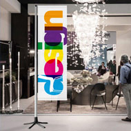
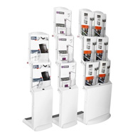
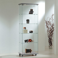
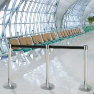
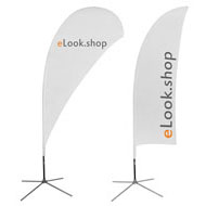
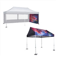
Mistake 3: Signage for trade fairs & events: Mobility underestimated, stability overestimated
At trade fairs and events, we repeatedly witness systems that appear "ideal" on paper failing in practical use. A mobile display that is difficult to transport or a roll-up banner that wobbles with every slight movement are examples of this. Mobility and robustness must be balanced.Just because a product is easy to move doesn't necessarily mean it's unstable. However, it must be carefully chosen for its intended use. Ask yourself: How often will it be transported? How will it be assembled? What is the surface like?
Differences in connecting elements, materials and mechanisms can make all the difference here.
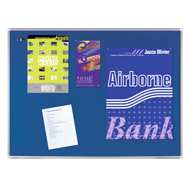
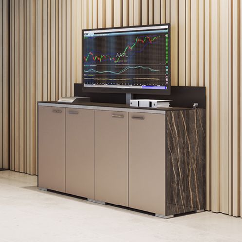
Mistake 4: Perception instead of reality: the unnoticed trap
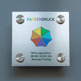
When starting out with signage and presentation, many focus on the external aspects: glossy surfaces, clean lines, and modern design. But often a simple sign delivers more because it is easier to read, easier to adapt and offers a clear information design.An unnoticed trap arises when one is blinded by the design instead of asking:
How quickly can I change content? How does the system perform in dim light? How robust is it in everyday use? Answers to these questions are more practical than mere aesthetics and prevent costly mistakes.
Mistake 5: No questions before buying signs and presentation systems
Ultimately, the goal is not to return to the "cheap solution," but to make a conscious and informed decision. Identify your needs:✔
Where will the product be used?✔
Who will use it – employees, customers, or visitors?✔
How often will it be moved, changed, or cleaned?✔
What effect should it have: informative, guiding, or representational?Knowing these points will clarify whether a high-quality acrylic sign is the right choice or whether a robust aluminum system is a better fit. Dimensions, materials, and service life – all of this will result from analyzing your specific application.
Conclusion
Buying the wrong sign isn't a matter of chance, but rather of focusing on what's essential: benefit, application and impact. By clearly defining and evaluating your requirements, you'll not only save money but also find solutions that truly work in everyday use.In the world of signage and presentation, it is truer than ever that it is not the product that decides, but the situation in which it is used.