Barrier-Free Signage - DIN 18040 Requirements and Practical Implementation
Friday, May 1, 2026
 Barrier-free signage is becoming increasingly important for companies, medical practices, law firms, and public institutions. It not only improves orientation but also enhances safety, inclusivity, and the overall professional appearance of a building.
In this guide, you will learn about the key requirements of DIN 18040 and how to implement them effectively and in compliance with the standards.
Why Companies Should Act
Many companies underestimate how strongly good signage influences first impressions and daily operations. Studies show that up to 30% of visitors in practices and office buildings have to ask for directions when orientation is unclear. Barrier-free and well-thought-out signage significantly reduces enquiries, saves staff time, improves customer satisfaction and strengthens the professional image.Legal Foundations
The central standard for accessible construction is DIN 18040. It defines clear requirements for the visual perception of information. In addition, DIN EN ISO 7010 applies to safety and escape route signage, along with various federal state accessibility regulations.A key consideration is that barrier-free signage must be understandable for all user groups — including people with visual impairments, seniors, and individuals with cognitive disabilities.
Key Requirements of DIN 18040
To be considered barrier-free signage should meet the following criteria:✔
High visual contrast between text and background✔
Sufficient letter size and easily legible fonts✔
Installation at an accessible and visible height (typically 140–160 cm)✔
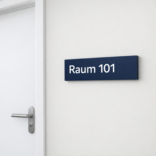
Non-reflective surfaces and lateral placement next to doors (not directly on the door leaf)✔
Clear information hierarchy✔
A consistent and coherent signage system throughout the entire buildingPractical Implementation from Outside to Inside
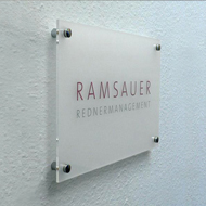
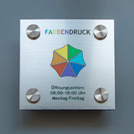
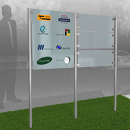
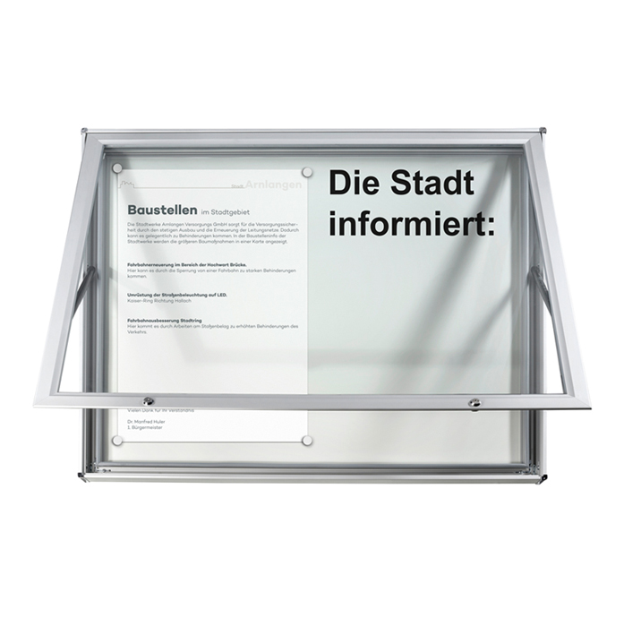
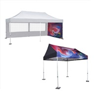
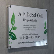
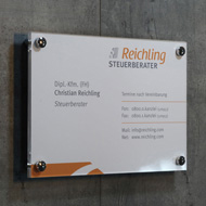
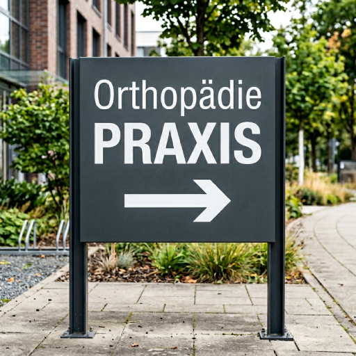 Barrier-free orientation begins in the outdoor area. A clearly visible and weather-resistant outdoor sign helps visitors quickly find the entrance. Durable materials such as acrylic and aluminium composite panels (Alu-Dibond) with direct printing offer excellent colour brilliance and long-term weather resistance.
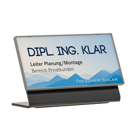
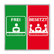
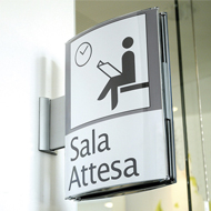
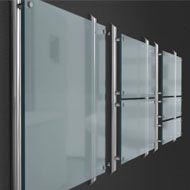
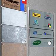
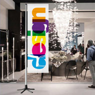
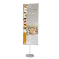
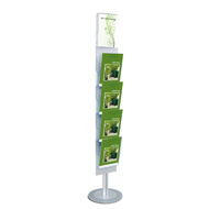
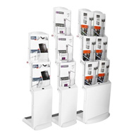
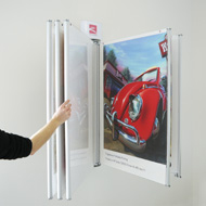
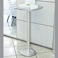
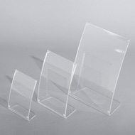
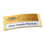
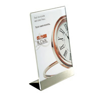
In interior spaces, uniform door signs play a central role. They should be clearly designed, easy to read, and ideally equipped with replaceable inserts. In larger buildings, it is recommended to implement a structured guidance system. Modular signage systems for wall mounting or freestanding solutions enable logical wayfinding and a consistent visual appearance.
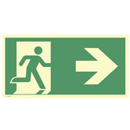
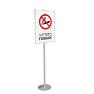
Safety signage is another area that should not be overlooked. Compliant safety signs for escape routes, emergency exits, and fire protection must be both clearly visible and positioned in accordance with regulations.
In a multi-story office building without a consistent wayfinding system, unnecessary orientation gaps often occur. Visitors need to ask for directions at reception, delivery personnel lose time searching for departments or meeting rooms, and emergency exits are not immediately recognizable. Introducing a structured signage concept with a clear hierarchy - from outdoor signs to directional signage and door signs - significantly improves orientation and reduces internal organizational strain.
Practical Implementation Tips
When planning accessible signage, the following steps have proven effective:- First, analyze the floor plan and define typical visitor routes.
- Establish a clear information hierarchy (primary directional signs, area identification, room identification).
- Align corporate design with contrast and readability requirements to combine functionality and brand identity.
A structured planning process prevents costly revisions and ensures a coherent, long-term signage concept.
Common Mistakes in Planning
Many organisations make the following mistakes:- Insufficient contrast or lettering that is too small
- Inconsistent design across different floors or areas
- Signs mounted directly on doors instead of next to them
- Overloaded signs with too much information
- Lack of a clear information hierarchy
Conducting a regular signage audit helps identify and correct such weaknesses at an early stage.