Mehr Aufmerksamkeit auf Hinweisschilder lenken
Samstag, 1. September 2018
Vielleicht wundern Sie sich, dass ein Schild nicht die Aufmerksamkeit bekommt, die Sie erwartet haben. Dies liegt häufig daran, dass es nicht im Blickfeld der Passanten untergebracht ist.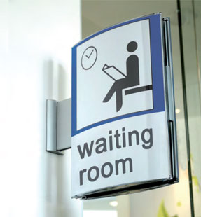
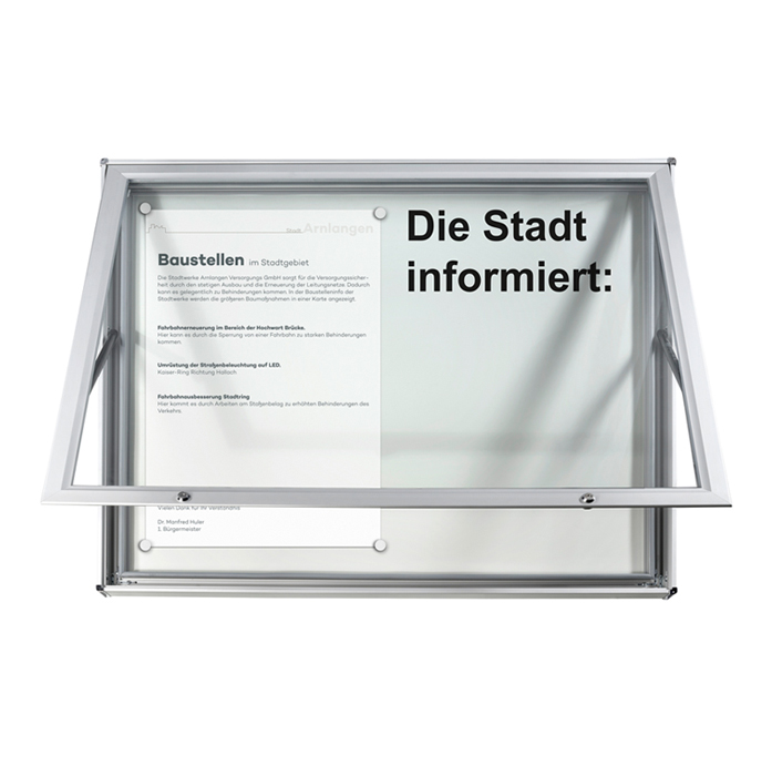
Aus diesem Grund sollte man Schilder, die wichtige Informationen enthalten, nie einfach flach an der Wand anbringen. Der Hinweis wie z.B. "Anmeldung im 1. OG" wird dort übersehen und Ihre Besucher irren durch das Haus auf der Suche nach Anmeldung. Auch ein wundervoll und perfekt gestaltetes Schild, welches eine interessante Veranstaltung ankündigt, wird von vielen Interessenten übersehen.
Gegenüber den freistehenden Infoständern haben die fest an der Wand senkrecht angebrachten Hinweisschilder 3 große Vorteile:
- Sie bleiben am Ort und können nicht von Unbefugten an einen anderen Platz gestellt werden.
- Ein Schild an der Wand stört nicht den Bewegungsraum. Dieser Aspekt ist besonders in Fluren von großer Bedeutung.
- Es lässt sich in ungefähr 2 Meter Höhe anbringen und liegt damit automatisch im Fernsichtbereich eines Menschen, der sich dem Schild nähert.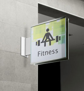
- Ein blauer Farbton ist der beste Hintergrund, wenn Sie etwas anbieten wollen – blau ist die Farbe der Gebotsschilder.
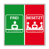
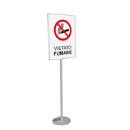
- Rot ist ein Warnfarbe, damit machen Sie auf Gefahren aufmerksam. Sie können damit natürlich auch auf Sonderaktionen verweisen.
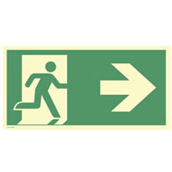
- Vermeiden Sie Grün, denn diese Farbe ist den Sicherheitsschildern vorbehalten. Sie weist auf Notausgänge, Sammelplätze und Stationen, die der Ersten Hilfe dienen, hin. Bei der Gestaltung der Rettungswegschilder halten Sie sich unbedingt an die aktuell gültige internationale Norm DIN EN ISO 7010.
- Beschränken Sie sich auf eine einfache klare Botschaft, auch wenn Sie auf dem Fahnenschild auf Sonderaktionen hinweisen. Die Aufschrift "Info hier" mit einem Pfeil, der zu einer Informationstafel führt, ist wirkungsvoller, als eine kurze Übersicht über die Aktion.
Wie Menschen die Umgebung wahrnehmen
Der Blick des Menschen ist nach vorne gerichtet, rein instinktiv bewegt er sich immer in die Richtung, in die er schaut. Das gilt sogar, wenn er sich nicht zu Fuß fortbewegt, sondern mit dem Auto fährt. Daraus folgt logischerweise, dass er im Vorübergehen ein Schild an der Wand zwar unbewusst sieht, aber dessen Botschaft nicht liest und nicht erfasst.Aus diesem Grund sollte man Schilder, die wichtige Informationen enthalten, nie einfach flach an der Wand anbringen. Der Hinweis wie z.B. "Anmeldung im 1. OG" wird dort übersehen und Ihre Besucher irren durch das Haus auf der Suche nach Anmeldung. Auch ein wundervoll und perfekt gestaltetes Schild, welches eine interessante Veranstaltung ankündigt, wird von vielen Interessenten übersehen.
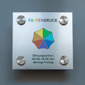
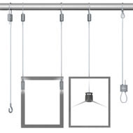
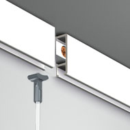
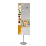
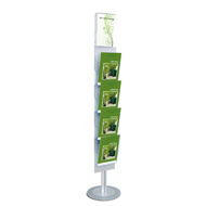
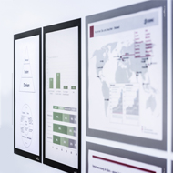
Schilder gekonnt platzieren
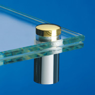
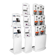
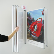
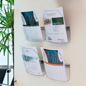
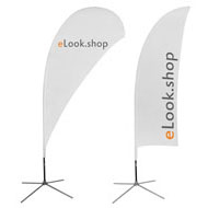
Nur ein Schild, dass die Botschaft direkt im Blickfeld anbietet, wird mit Sicherheit bemerkt. Neben Kundenstoppern und Plakatständern sind die Wandschilder des Typs "Ausleger" bzw. "Fahnenschilder" eine gute Option. Diese ragen senkrecht in den Raum, lassen sich knapp über Augenhöhe an der Wand oder von der Decke hängend unterbringen. Verwenden Sie für die senkrechte Wandmontage spezielle Halter, in denen die Schilder eingeklemmt werden beziehungsweise an denen Sie diese anschrauben.Gegenüber den freistehenden Infoständern haben die fest an der Wand senkrecht angebrachten Hinweisschilder 3 große Vorteile:
- Sie bleiben am Ort und können nicht von Unbefugten an einen anderen Platz gestellt werden.
- Ein Schild an der Wand stört nicht den Bewegungsraum. Dieser Aspekt ist besonders in Fluren von großer Bedeutung.
- Es lässt sich in ungefähr 2 Meter Höhe anbringen und liegt damit automatisch im Fernsichtbereich eines Menschen, der sich dem Schild nähert.
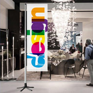
Tipps für die Gestaltung von Auslegern und Fahnenschildern
Damit die Fahnenschilder niemanden stören und es keine Unfallgefahr besteht, müssen Sie diese in einer Höhe von mindestens 2 Metern anbringen. Damit ist zwar ausgeschlossen, dass ein Besucher das Schild aus der Nähe in Ruhe studiert. Er wird es aber aus größerer Entfernung bemerken, sofern es sich farblich von den Wänden abhebt.- Ein blauer Farbton ist der beste Hintergrund, wenn Sie etwas anbieten wollen – blau ist die Farbe der Gebotsschilder.
- Rot ist ein Warnfarbe, damit machen Sie auf Gefahren aufmerksam. Sie können damit natürlich auch auf Sonderaktionen verweisen.
- Vermeiden Sie Grün, denn diese Farbe ist den Sicherheitsschildern vorbehalten. Sie weist auf Notausgänge, Sammelplätze und Stationen, die der Ersten Hilfe dienen, hin. Bei der Gestaltung der Rettungswegschilder halten Sie sich unbedingt an die aktuell gültige internationale Norm DIN EN ISO 7010.
- Beschränken Sie sich auf eine einfache klare Botschaft, auch wenn Sie auf dem Fahnenschild auf Sonderaktionen hinweisen. Die Aufschrift "Info hier" mit einem Pfeil, der zu einer Informationstafel führt, ist wirkungsvoller, als eine kurze Übersicht über die Aktion.