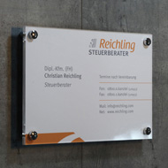
Farbpsychologie im Schilderdesign: Wirkung von Farben auf unsere Emotionen
Donnerstag, 1. Februar 2024

Die Verwendung von
Farben in Schilderdesigns beeinflusst maßgeblich unsere Wahrnehmung und emotionale Reaktion auf Informationen. In diesem Artikel werden wir uns mit der Farbpsychologie im Kontext des Schilderdesigns auseinandersetzen, wobei der Fokus auf der allgemeinen psychologischen Wirkung von Farben liegt.
Emotionale Bedeutung von Farben
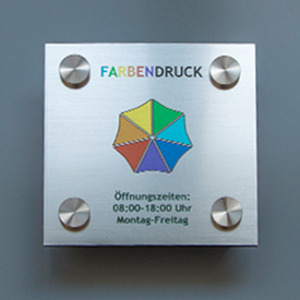
Jede
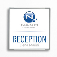
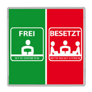
Farbe hat eine einzigartige emotionale Bedeutung, die direkt mit unserer Psyche verbunden ist. Blau wird oft mit Ruhe und Vertrauen assoziiert, während Rot leidenschaftliche Gefühle hervorrufen kann. Gelb vermittelt Frische und Optimismus, während Grün mit Natur und Frieden verbunden ist. Die bewusste Auswahl von Farben in einem Schilderdesign kann somit gezielt Emotionen beim Betrachter auslösen.
Farbpsychologie in der Werbung
In der Werbewelt spielt die Farbpsychologie eine entscheidende Rolle. Unternehmen
nutzen gezielt bestimmte Farben, um ihre Markenbotschaft zu verstärken. Warme Farben wie Orange können Aufmerksamkeit erregen, während kühle Farben wie Blau Seriosität vermitteln. Die Anwendung dieser Prinzipien im Schilderdesign kann dazu beitragen, die
gewünschten Reaktionen der Zielgruppe zu
erzeugen.
Farben und ihre Auswirkung auf die Entscheidungsfindung
Studien zeigen, dass
Farben nicht nur Emotionen beeinflussen, sondern auch die
Entscheidungsfindung beeinflussen können. Zum Beispiel kann die Verwendung von Rot in Verkaufsschildern impulsives Handeln fördern, während ein beruhigendes Blau in einem Hinweisschild den Betrachter zum Verweilen einlädt. Diese subtilen Effekte können in verschiedenen Kontexten, von Einzelhandelsumgebungen bis hin zu öffentlichen Räumen, eingesetzt werden.
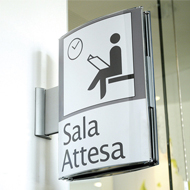
Farben und die psychologische Wirkung im Alltag
Selbst in unserem täglichen Leben beeinflussen Farben unsere Stimmung und Wahrnehmung. Die Wandfarbe in einem Raum oder die Farben von Straßenschildern können unser Verhalten beeinflussen, ohne dass wir es bewusst wahrnehmen.
Das Verständnis der Farbpsychologie im Schilderdesign ermöglicht es, gezielt positive oder
gewünschte Reaktionen bei den Menschen hervorzurufen.
Fazit
Die
Farbpsychologie im Schilderdesign ist ein mächtiges Werkzeug, um Emotionen zu beeinflussen und Reaktionen hervorzurufen. Von der Werbung bis zum alltäglichen Umfeld spielen Farben eine entscheidende Rolle in unserer Wahrnehmung. Die bewusste Anwendung dieser Prinzipien ermöglicht es, die gewünschten Botschaften zu kommunizieren und positive Reaktionen bei der Zielgruppe zu erzielen.
In der Gestaltung von Schildern sollte die Auswahl der Farben daher sorgfältig durchdacht sein, um die beabsichtigte emotionale Resonanz zu erzeugen.